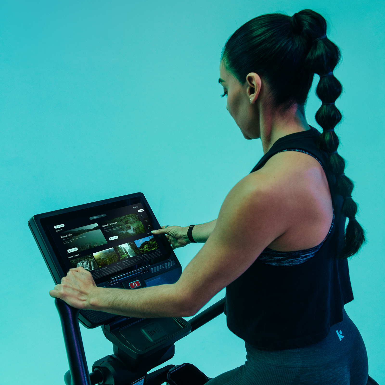
Apex Touch Display UI/UX
Creative Direction: Leslie Marois
SR Dir. product & technology: Travis vaughan
Director of product - Cardio: ellA verhees
ux/ui design: Ana Karina arreola
In 2023, I led the creative direction for the Next Gen Cardio Console UI/UX Project , collaborating with Senior Director of Product & Technology, Travis Vaughan, and freelance UI/UX designer Karina Arreola. The initiative was part of a complete redesign of our Star Trac and StairMaster cardio lines—equipment that hadn’t seen a major update in decades, conceptualized and run by Director of Product - Cardio, Ella Verhees.
My focus was ensuring the user experience matched the sophistication of the new hardware design. Research into emerging UI trends guided our approach—bold typography, micro-interactions, gamification elements, neomorphism styling, and the introduction of dark mode. We pushed beyond dated iconography into minimal, trend-forward visuals, layered with dynamic color palettes, abstract backgrounds, and improved menu flow and visuals that gave the console a fresh, tactile feel.
I presented three distinct design concepts, each expressed through the most critical user flows: Main Menu, Quick Start Workout, and Build A Workout. Working in Figma and Jira, we iterated weekly as a team—aligning on details, critiquing, and refining.
The result: a console experience that feels intuitive, modern, and aligned with the digital habits users already know from their phones and tablets. My favorite outcome? Asymmetrical layouts with a striking dark mode option, bringing both longevity and elegance to the design.
Industry content:
National Fitness Trade Journal Article: “Apex Redefines the Cardio Experience”
challenge
Cardio consoles hadn’t been updated in years. Functionality was outdated, icons felt tired, and the user journey lacked flow. With the launch of the new equipment line, we needed a modern UI/UX system that felt intuitive, trend-forward, and worthy of the redesigned machines.
Previous Touch Display Home Screen
Apex Touch Display Home Screen
approach
Research of leading UI/UX trends and defined a creative direction that emphasized:
Bold typography — strategic, confident, legible
Micro-interactions — elevating the user journey beyond static buttons
Gamification — weaving motivation into the workout experience
Neomorphism — blending digital and tactile design with gradients, shadows, and highlights
Minimal, modern icons — custom or curated for longevity
Dark mode — sleek, futuristic, user-preferred
Color palettes — natural tones, soft pastels, and striking contrasts
While the Product Team ensured programming, content and functionality improvements aligned with their vision and goals.
execution
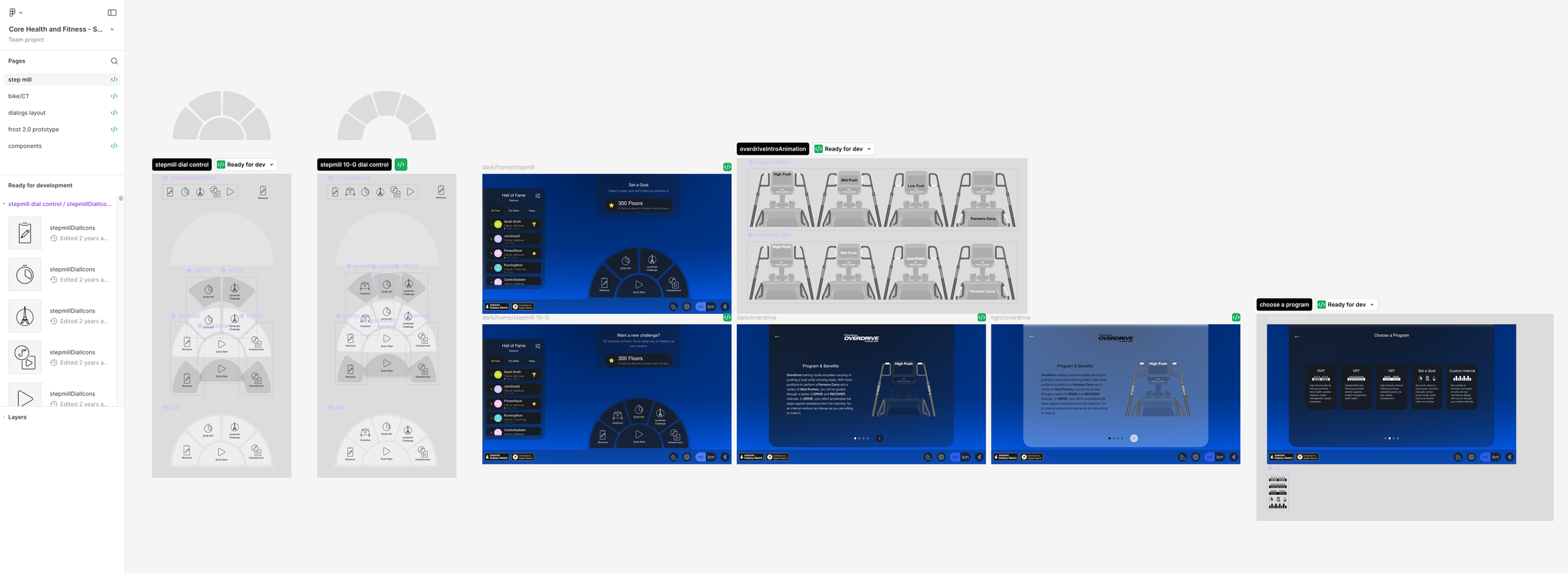
Working in Figma with project management in Jira, we held weekly critique sessions to refine and align. I guided the creative vision while ensuring UX principles stayed at the forefront — balancing aesthetics with usability.
Example of collab and review space
results
The Apex Touch Display launched with a modern, intuitive interface that feels familiar yet elevated. Users can navigate like they would on their phones or tablets, while experiencing a workout environment that is fresh, motivating, and immersive.
My favorite outcome? The asymmetrical layouts paired with options like dark mode and background, creating a console experience that feels as premium as the equipment itself.


